Our Brand Defined
 Our Brand Defined
Our brand is symbolic of both our focus on building and managing the retirement (SECOND HALF of life) that a client aspires to experience and our commitment to working with our clients in a COACH-like capacity.
Our Brand Statement
We Retire Every Day
Our Brand Promise
We are the coach at your side, not the salesperson in your ear.
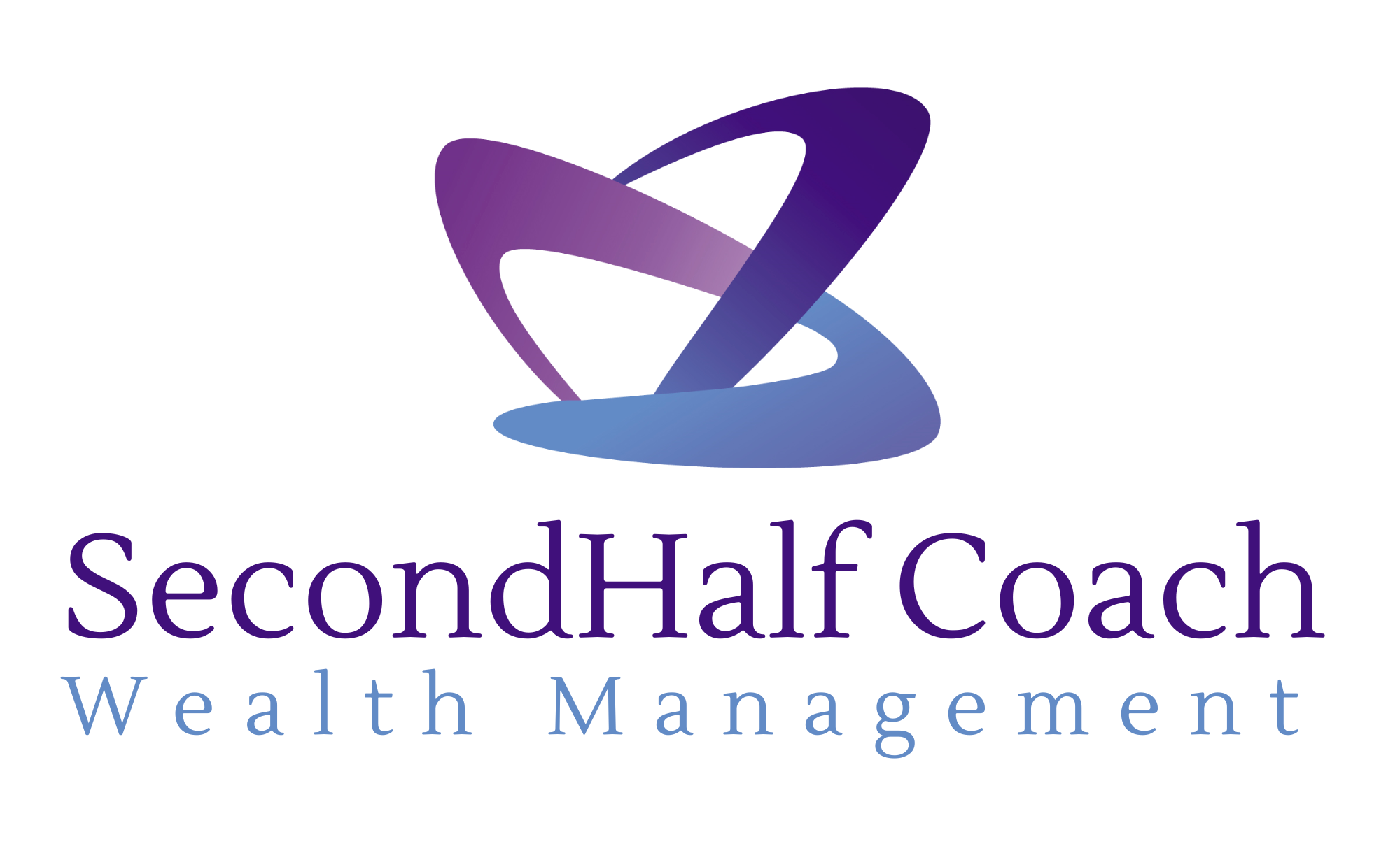
Current Logos 2017 - Present


This logo was designed in 2017 by 535 Media when our firm name evolved from The SecondHalf Coach to SecondHalf Coach Wealth Management. Our name and logo were changed slightly to design variations that included the words “wealth management” and omitted “The” from the beginning to provide a clearer understanding of the purpose of our work to those who did not yet have a relationship with our firm.
The icon of our logo maintained the original principle of representing our core values in the shape of boomerangs believing that if we embodied those values, those who worked with us would be inspired to return them back to our team. While the icon retained its original concept, the design was altered slightly to have a more modern look that could serve as its own stand- alone variation of our logo without words.

Logo 2006-2017
This logo was designed in 2006 by William Urbanik when the name, The SecondHalf Coach, was formally adopted. It was designed to reflect our core values represented by three boomerang shapes. Each of the three boomerangs shapes represented one of our core values as well as the thought that if our firm embodies these values when dealing with our clients, our clients will be inspired to return those values back to our team. The colors of navy blue, gold and red were chosen for their professional yet sporty appearance.